// PROJECT SUMMARY
SOVIL works with empirical data demonstrating the impact of solar exposure and shading on indoor temperatures, with a particular focus on the growing challenge of keeping buildings cool.
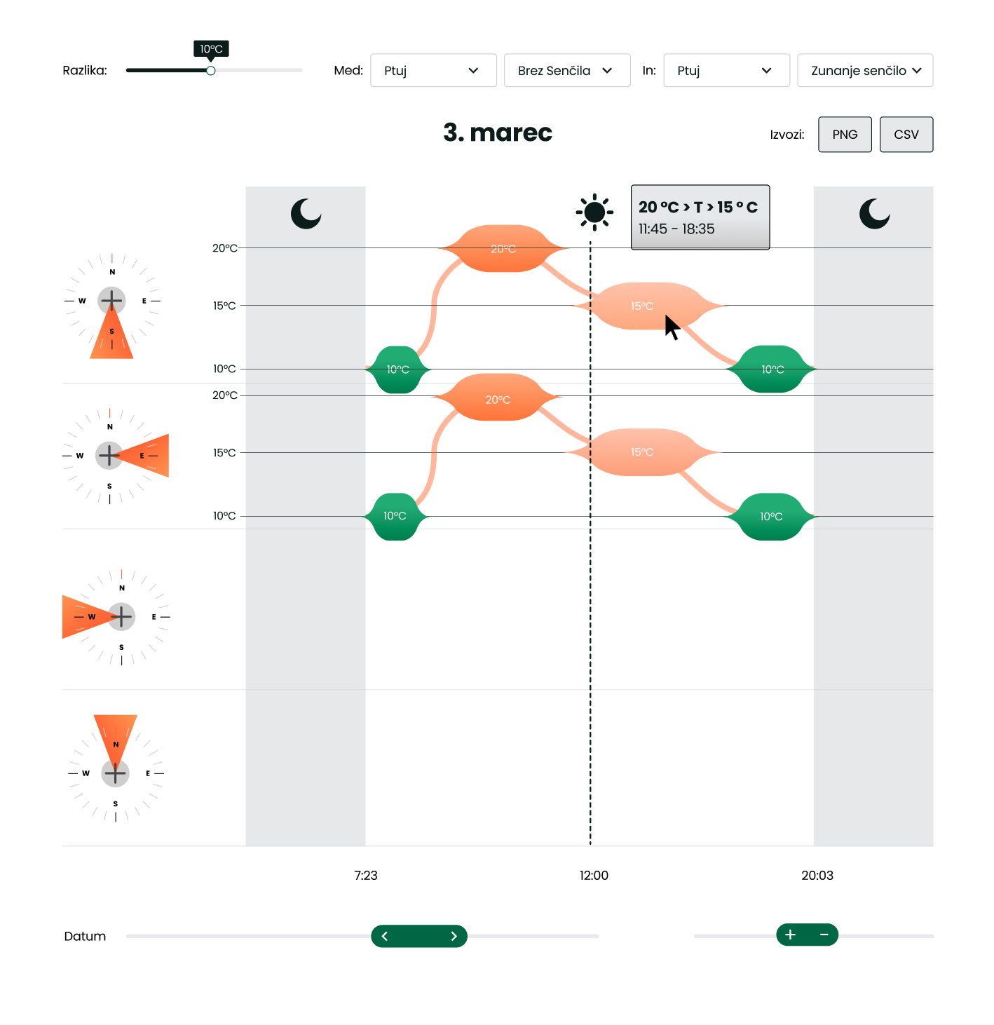
The underlying engineering data was strong, but difficult to communicate outside a technical audience. JPM Systems developed an interactive web-based visualization tool that allows anyone to quickly compare how different orientations and shading solutions affect indoor temperature.
// THE PROBLEM
Engineering data is often presented through detailed charts, tables and technical reports. These formats work well for experts, but they can become a barrier when the goal is to communicate the same knowledge to homeowners, architects, decision-makers or the general public.
SOVIL had extensive empirical data describing how buildings respond to solar exposure and different shading configurations.
The challenge wasn't generating more data. It was making the existing knowledge understandable to the people who could benefit from it.
Traditional engineering charts contained too much information and required too much technical knowledge to interpret. SOVIL needed a way for users to intuitively understand the effect that building orientation and shading can have on indoor temperature.
// THE SOLUTION
We developed the SOVIL Dashboard, an interactive web application that transforms technical measurement data into a simple visual comparison.
Instead of interpreting engineering tables, users can select different building orientations and shading configurations and immediately compare the resulting indoor temperatures.
The focus of the project was therefore not simply custom software development, but the UX behind communicating complex technical information.
We designed the experience around the actual audience rather than around the structure of the underlying engineering data.
// OUR WORK
JPM Systems was responsible for:
- – Product concept development
- – UX architecture
- – User journey development
- – Custom software development
- – Web application development
- – Frontend development
- – Data processing
- – Engineering data visualization
- – Interactive comparison tools
- – Translation of technical data into user-friendly information
- – Testing and UX refinement
// KEY CHALLENGES
Designing for the Audience, Not the Engineer
The people who understand the raw data best are not necessarily the people who need to use the final tool.
A major part of the project was deciding what information users actually need to see and what should remain hidden.
Instead of reproducing existing engineering charts in a browser, we redesigned the way the information itself is presented.
Turning Data into Understanding
Displaying data and communicating knowledge are two different problems.
The tool needed to help users quickly answer practical questions: What happens to the temperature if this window faces another direction? How much difference can a particular shading solution make?
The UX was therefore built around comparison and visual understanding rather than raw numerical analysis.
Simplifying Without Losing Meaning
Technical simplification introduces another challenge: removing complexity without misrepresenting the underlying engineering results.
We worked with the available empirical data to create an interface that remains connected to the real measurements while presenting them at a level appropriate for a non-technical audience.
Dissemination of Technical Knowledge
The project demonstrates an important role of digital products: making specialist knowledge accessible beyond the specialists who created it.
By combining engineering data, UX design and interactive software, complex research can become something users can explore and understand themselves.
// THE RESULT
The SOVIL Dashboard transforms complex building-performance data into an accessible interactive experience.
Instead of studying engineering charts and tables, users can quickly compare indoor temperatures under different orientations and shading configurations and understand the impact visually.
The project demonstrates how UX development, custom software and data visualization can bridge the gap between technical expertise and public understanding — turning engineering data into knowledge that people can actually use.